Access to dozens of events happening on a campus near you.
Easy sign up to events.
Event notifications or reminders sent to your phone.
A way to find out who else is attending.
Tools Used: Figma, Maze, Miro
The Problem
College students pay a mandatory Student Activity Fee along with their tuition. The Student Activity Fee covers all costs associated with extracurricular activities that happen outside of the classroom—a big part of the collegiate experience. Because students pay mandatory Student Activity Fees, one would expect that students would come flocking to events. This is not true. Many students don’t attend events on a regular basis. The main reason is they don’t hear about them enough in advance.
Unsure of where to sign up.
Overwhelemed with events.
Unable to attend live events.
My Process
I decided to focus on an app solution because students always have their cell phones on hand and will be able to receive push notifications about events. I interviewed students who stated they wanted to be notified about events via their college email, however, students only check that when they are on campus or in class. From here I developed a problem statement:
Problem Statement
Students at universities need a more enriching college experience so that they can attend events and connect with students outside of class.
I decided to conduct user interviews from this point.
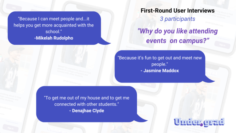
First-Round User interviews
Participants answered questions to share about their motivation for attending events on campus. All respondents wanted to meet/connect with new people at an event. Here are some additional takeaways:
Students wanted to be able to meet new people at events.
Students wanted to be contacted by email to learn about events in enough time.
Students wanted a takeaway– or to leave with something meaningful from attending an event.
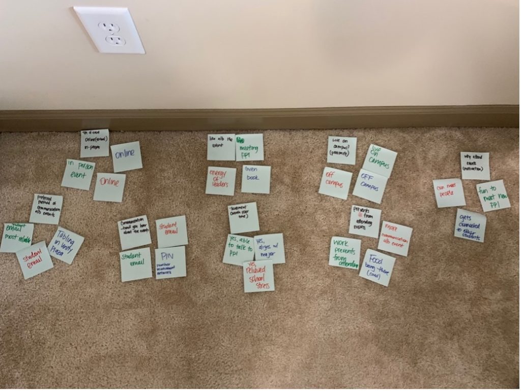
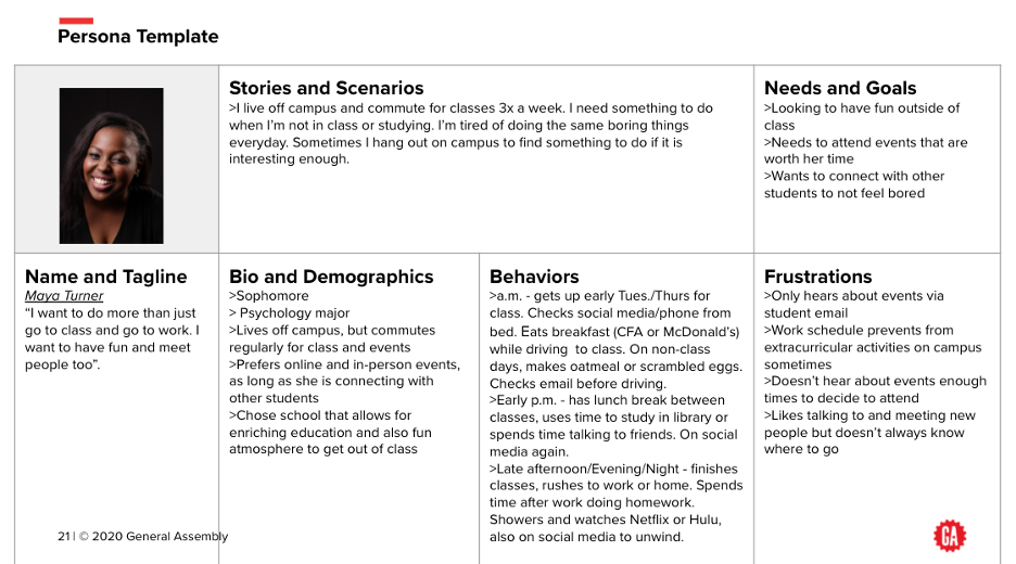
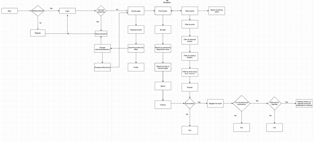
First-round user participants provided enough information for me to create an affinity map, a user persona, a user flow and initial sketches of the Under.grad app.
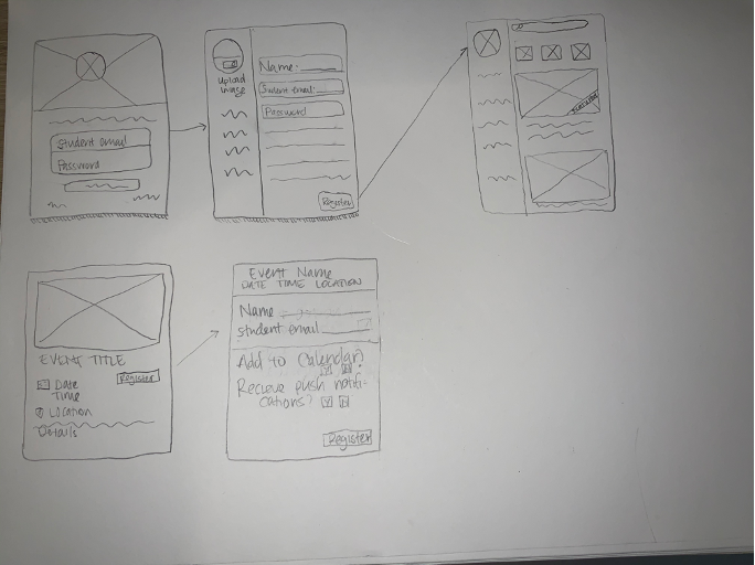
Low Fidelity Wireframes
Next, the first iteration of the low fidelity wireframes were created using Figma.
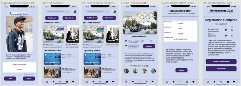
Mid Fidelity Designs
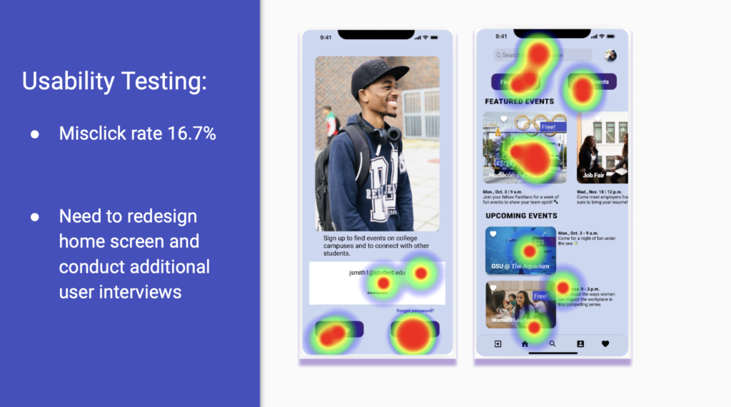
User testing
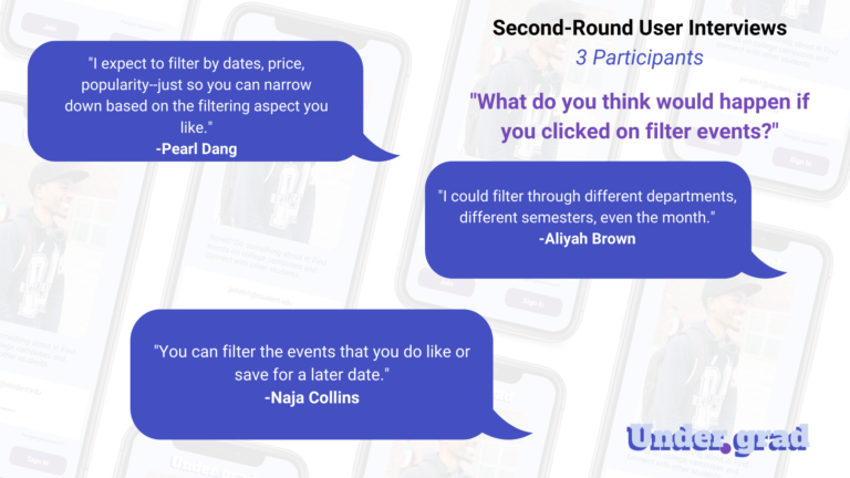
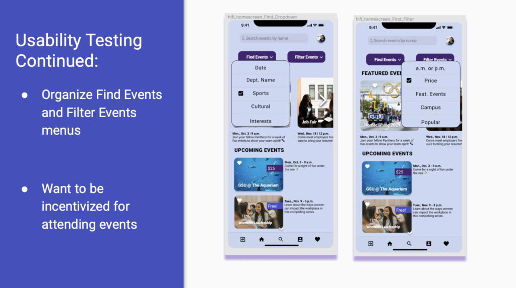
I created high fidelity designs and set up another usability test using Maze. My goal was to I test functionality and the user flow of the design. Feedback from the second design iteration was collected to make more design improvements, including adding a feature to sort and filter events.
The Maze usability test showed a design flaw, which prompted me to ask additional questions about features during second-round user tests. These design upgrades were shown in the second and third iterations of the app.
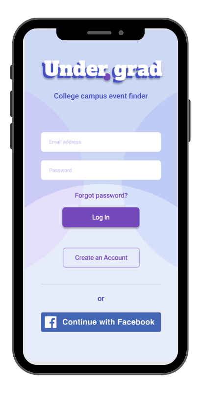
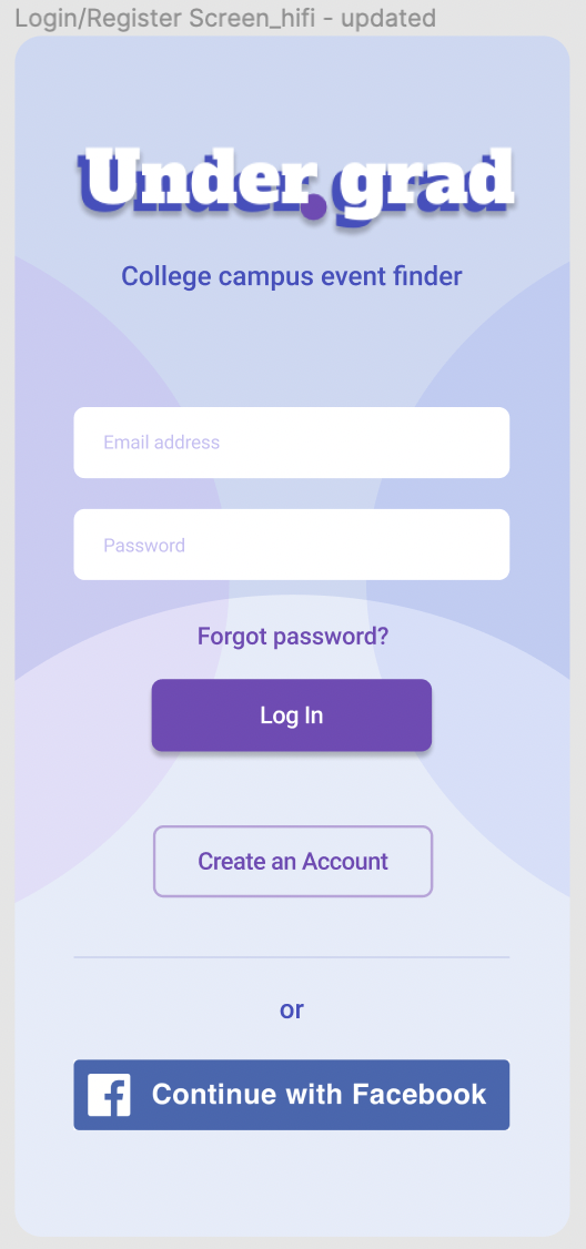
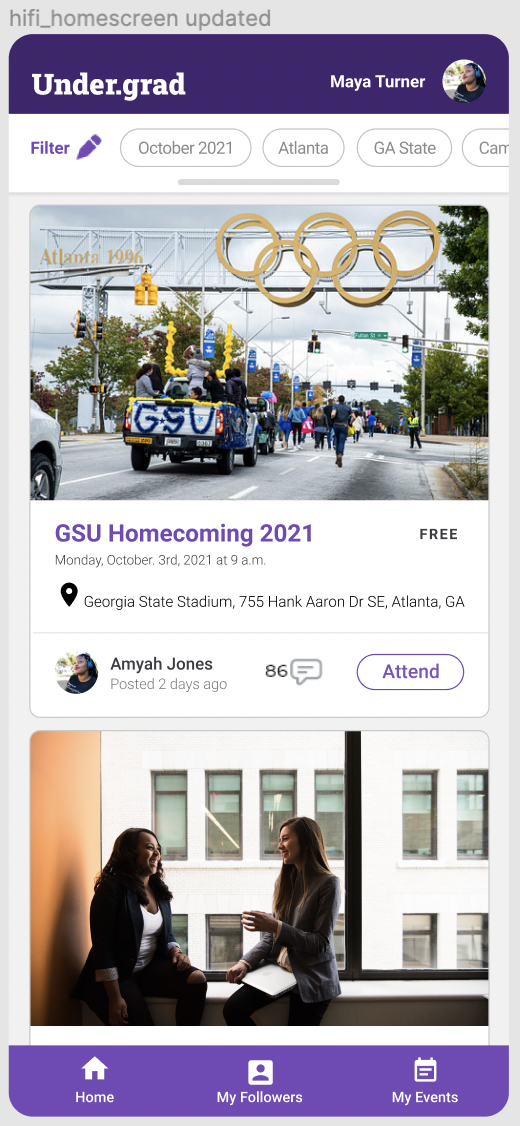
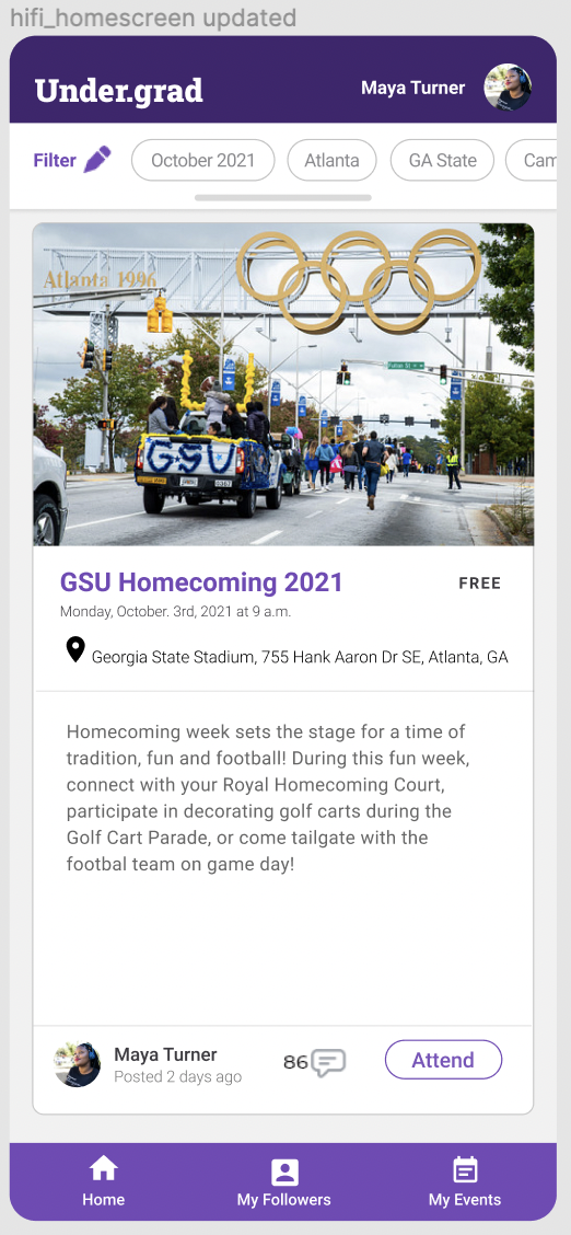
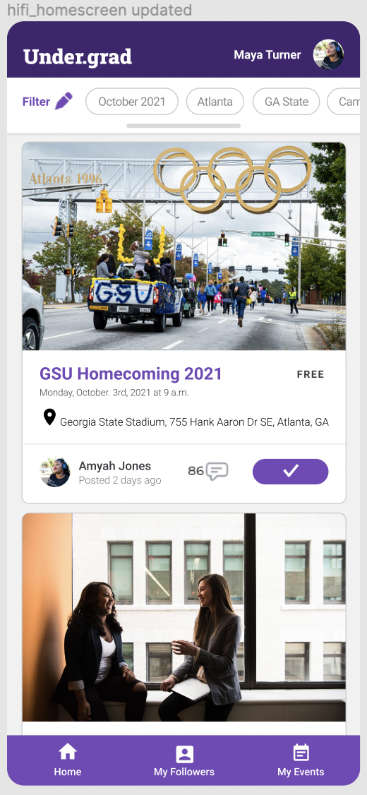
High Fidelity Designs
The UX Bootcamp concluded, but I wanted my designs to have another upgraded look. I watched a few more design thinking videos on YouTube and connected with other UX designers to learn more about their processes. I was able to design my final screens applying what I learned. The Login Screen, Home Screen and Events Description Screen all received an upgraded look. Additionally, the filter, comment, profile picture and sign up became more prominent on screen and allowed for to user to find and sign up for events easily.